Apple Human Guidelines explained
UI resources and information on Apple’s devices are provided in Apple’s Human Interface Guidelines (HIG). There is a lot of information designers should use and pointers to design intuitive and better app interfaces.
Apple has organized the HIG into categories for each of its device platforms. macOS, iOS, watchOS, and tvOS are all separated, allowing you to read about specific platforms you will be developing for instead of being overwhelmed all at once.
Once you choose a platform, you can further go into the specific topic that interests you. For example, UI controls, app architecture, views, or controls.
When you receive the wireframes, you need to start organizing each element on the screen. The HIG is an excellent resource for reviewing recommendations and learning about why the basic styling should be placed in specific locations on the interface. For example, on iOS, it’s common to have the “previous screen” button in the top left corner.
You’ll also learn about margins, safe areas, and other essential details to ensure your app will present its best and no content will be illegible.
Every iOS release introduces new features to stay competitive in the market. Chances are you might want to take advantage of the new features, and the HIG will explain how you can use them and where you should include them in your app.
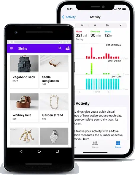
Android Material Design explained
While the first release of the Android 1.0 operating system was in 2008, it wasn’t until 2014 that Google’s Material Design was defined and introduced to the public.
The material design originated from the “Google Now” app and used a grid-based layout with effects to show depth, such as shadows behind elements.
Google’s design language is based on real-life items like ink and paper, so everything is very minimalistic, with a few colors assigned to specific functions, e.g., a blue button, a red navigation bar, and blue toggles.
Material Design has evolved into Material Design 2, emphasizing rounded corners, white space, and colorful icon treatments. There is still a strong preference for having a flat user interface design.
In Google’s Material Design manual, you can learn about Design, Components, and Development, each divided into categories with much helpful information for each type. For example, if you want to know about how floating action buttons work, head into Components > Buttons: floating action button, and you’ll get a page full of interactive examples, descriptions of behavior, specifications, and a lot more.


